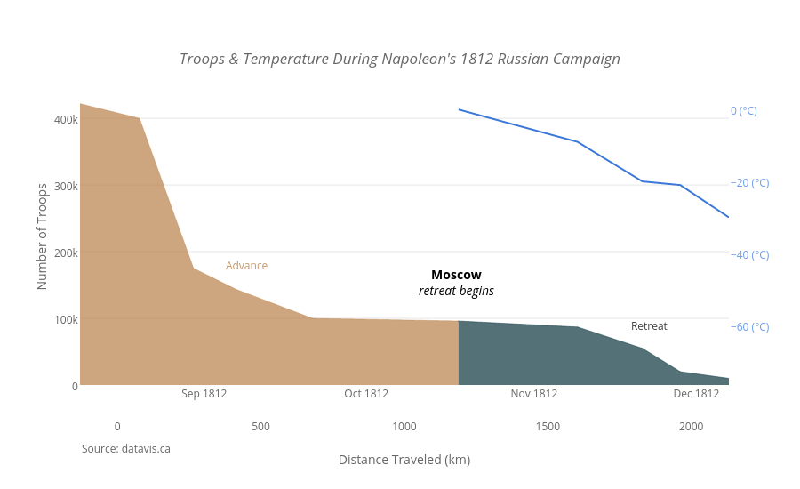
March on Moscow
Plotly's version of Charles Minard’s 1869 graph
of Napoleon’s 1812 march on Moscow that shows the dwindling size of the
French army.

John Snow & Cholera Cases
John Snow’s classic map shows the sources of an 1854 cholera outbreak in London. See our rendition below.

Causes Of Mortality
This plot shows causes of death in the army during the Crimean War from 1854-‘56, based on Florence Nightingale's classic.

The Earth
Plotly’s own Chelsea Lyn made this 3D MATLAB
globe that shows countries, bodies of water, latitude and longitude, and
a flight plan.

Hans Rosling
Hans Rosling, one of the founders of Gapminder,
created a bubble chart that assigns four variables to each country: life
expectancy (y-axis), GDP (x-axis), continent (color), and population
(bubble size). Here is Plotly's version:

Anscombe’s Quartet
Anscombe’s Quartet shows four datasets produced
by Francis Anscombe in 1973. The datasets have identical (to two decimal
places) linear regression coefficients, x and y means, x and y
variance, and Pearson Correlation Coefficients. The point is: statistics
alone would be confusing and incomplete. Graphing lets us understand
the data.

Imports & Exports Line Chart
William Playfair (1759 - 1823) was a Scottish
engineer and political economist. He invented the line graph, bar chart,
pie chart, and circle graph. His graph below tracks how England went
from importing more than it was exporting to exporting more than it was
importing.

See the full post for more details, links to our
tutorials and the interactive versions of these graphs. If you like the
post, please share:
http://blog.plot.ly/post/120532468127/how-to-analyze-data-seven-modern-remakes-of-the
|
|
|