twitter

Thursday, 25 June 2015

Plotly Weekly Roundup

Plotly Weekly Roundup


Hey TrylLans,

Happy Thursday!

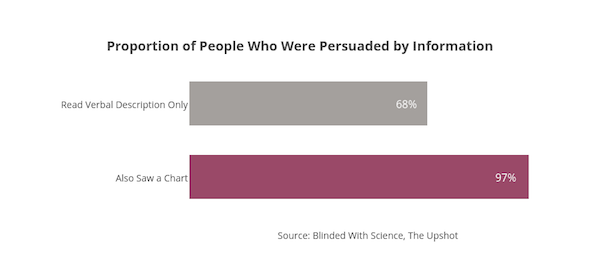
In a recent study, researchers gave participants information about a made-up drug. Some of the participants also saw a chart. The chart repeated information the participants had read. But showing it as a chart made it persuasive. The proportion who believed in the effectiveness of the drug rose to 97 percent from 68 percent for those who had seen the chart. The chart above is a chart about how persuasive that chart was.

The conclusion: charts are persuasive. Over the next few weeks, we’ll be publishing posts that demonstrate and examine chart types. Our goal is to help you be persuasive, effective, and clear with your data. This post shows bar, line, scatter, area, and box plots. Next time we’ll show histograms, heatmaps, and 3D plots.

See the
full post for more details, links to our tutorials, and the interactive versions of these graphs. If you like the post, please share:

http://blog.plot.ly/post/121630307412/how-to-analyze-data-seven-beautiful-ways-you-can

Contact us if you're interested in a trial of Plotly Enterprise.


Part I: Basic Chart Types


1. Bar Chart
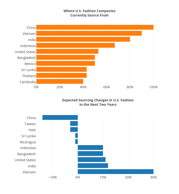


Bar charts show rankings, comparisons, and values as parts of a whole. Here we’re showing the percentage of where U.S. fashion companies source from and where they will source from in the future. The researchers note that “fashion companies are NOT moving away from China.”


2. Line Charts


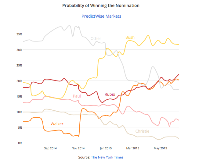
Line charts are ideal for showing time series data–events over time–and deviations between values. Studies have indicated that 75% of business graphs display time series data. Below we’re showing how the probability of winning the Republican nomination for president has changed over time in a prediction market. To learn more, see our time series tutorial.


3. Scatter Charts


Scatter plots show correlations for paired values or rankings. This chart plots the financial returns on a college degree against the selectiveness of universities, organized by field. Click the traces in the legend to turn them on and off. Returns depend more on field of study than selectiveness of the university. For example, engineering, computer science, and math have a 20-year annualized return of 12%. The S&P 500 was 7.8%.


4. Box Plots


Box plots are useful for comparing distributions, especially when you have multiple observations of the same event. For example, this box plot shows the median, interquartile range, whiskers, and outliers of the same data as shown above. Now we can see a side-by-side comparison of the investment returns by field.


5. Area Charts


Below, the percentage of users of a given browser is shown as an area chart. The space taken up by the area chart shows the actual percentages of usage. At a glance, we can see the growth of Google Chrome and decline of Internet Explorer.


6. Combining Plots


The plot below shows how you can use Plotly to combine chart types and add a custom hover text field. If you hover your mouse on the subplots, you’ll be able to see estimated budget plotted against profit and U.S. gross, plus the film. The lessons: sequels do make profit, though less than their precursor; larger budgets correlate with higher box office returns though not always larger profit.


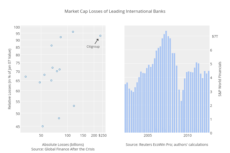
In another combination plot, we can show losses sustained by major banks during the financial crisis. Our scatter chart adds specificity: absolute losses vs. relative losses for individual banks.


See the full post for more details, links to our tutorials and the interactive versions of these graphs. If you like the post, please share:

http://blog.plot.ly/post/121630307412/how-to-analyze-data-seven-beautiful-ways-you-can